Description
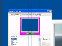
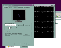
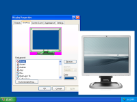
After reading the Google Docs memo and seeing that this was one of the raised points for a 0.4 release I'm working on improving desk.cpl:
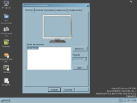
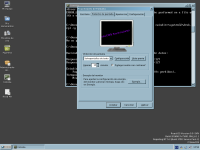
- Make it look a bt more like the original dialog, with similar dimensions and positioning for controls.
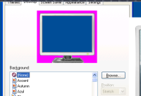
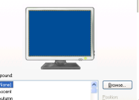
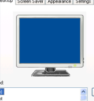
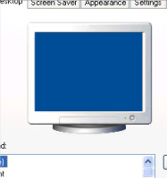
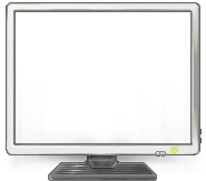
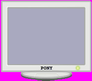
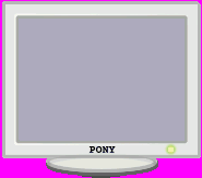
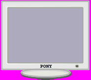
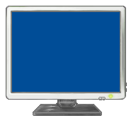
- Re-do the bitmap of the preview monitor surrounding the actual desktop background, current one is old and dithered (Important: retain the PONY mark).
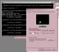
- Consistently use the monitor bitmap as a frame for the rest of tabs (Appearance, Resolution, ...).
That's mostly it.
Attachments
Issue Links
- relates to
-
CORE-11614 [Vote] Please vote which version of the monitor is better for desk.cpl
-
- Resolved
-
-
CORE-11578 [Resource] Monitor for Desk Properties dialog
-
- Closed
-
-
CORE-18744 Desk.cpl screensaver preview got smaller, an optimization challenge
-
- Open
-
-
CORE-17939 desk.cpl: No focus after resolution change
-
- Open
-
-
CORE-18187 Display properties selects wrong color depth
-
- Resolved
-
-
CORE-16309 Informative text on Display Properties dialog box
-
- Open
-
