Details
Description
Reduce the left border a bit for the 1st and 2nd page in order to:
- look more like XPSP3/2k3sp2 taskmgr which has a smaller border there
- improve symmetry to the right border
- have more space for the actual listviews
- have slightly more space for the text of "Show processes from all users"
This requires moving both listviews and that Checkboxes x position slightly to the left.
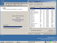
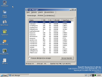
![]() ros_taskmgr_BEFORE_mostCompact.png
ros_taskmgr_BEFORE_mostCompact.png![]() (yes that 0.4.7-pic is a bit outdated but the borders are still the same on 0.4.15-dev-3878-gd9f156e)
(yes that 0.4.7-pic is a bit outdated but the borders are still the same on 0.4.15-dev-3878-gd9f156e)
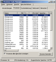
![]() XPSP3_Taskmgr_mostCompact.PNG
XPSP3_Taskmgr_mostCompact.PNG![]()
when doing this remember to harmonize de-DE.rc text of IDS_MSG_TRAYICONCPUUSAGE
I will wait before starting to work on this until https://github.com/reactos/reactos/pull/4323 will be merged to avoid having that contributor to rebase anything.


