Details
-
Improvement
-
Resolution: Unresolved
-
Minor
-
None
-
None
-
None
Description
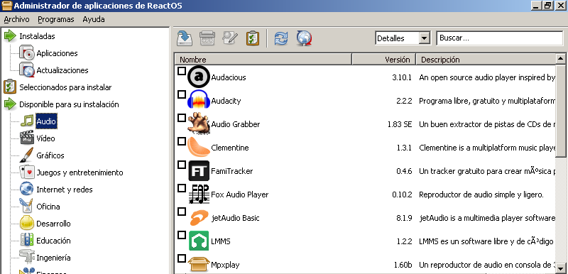
When I browse through the RAPPS repository, I can't stop thinking about how ugly and cold the store feels when you scroll down.
This problem happens because most of the apps that RAPPS offer, don't have any distinguishing icons that helps the user to find them at a glance.
Currently there is an ongoing draft to add all those missing icons. However, this effort could be in vain if a few months later another new pile of apps without icons starts damaging the look of the store. Maybe, we should enforce that new submissions include a graphical icon related to the committed software, and if that's not the case, ask for a justification why (because not all programs have any kind of logo that represents them).
With this draft, we could renovate the look of the store and make it less unattractive to the user:
Before

After


