Details
-
Bug
-
Resolution: Fixed
-
Major
-
None
-
None
-
Operating System: ReactOS
Platform: x86 Hardware
Description
Some display problems appear when you resize the window of the web-browser
where you are viewing the new website :
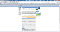
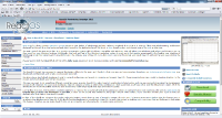
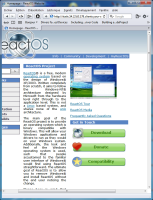
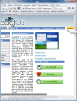
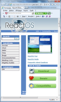
- When the window is too narrow, the right column overlaps the central and the
left columns (see screenshots 4-1, 4-2, 4-3 and 4-4). - When the window is narrow in such a way that you must scroll horizontally the
window's content, the upper links bar is shown "cutted-off" (see picture 3-1)
and, when you hover above where a link must be displayed, the orange selection
rectangle appears with the text, but without the blue background (picture 3-2).
Some suggestions :
- I suggest setting a minimal width for the central column in such a way that,
when you reduce the width of the browser's window too much, the left and
central columns are still readable, but the user will have to scroll
horizontally to see the right column (as the old ReactOS website does) (see
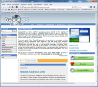
picture 4-5). - Furthermore, I think that having the expandable central column is great, but
it should always expand, having ONLY a minimal width threshold but NOT a
maximal width threshold, as it seems to have currently (see pictures 1-1 and
1-2 when I unzoom the webpage). The new webpage should behave as the webpage of
our current old website (picture 2-2). To sum up, the new website's page should
behave like in picture 2-1.
