Uploaded image for project: 'ReactOS Online Service'
  1. ReactOS Online Service
  2. ONLINE-285

Rearrange right menu on main page

    XMLWordPrintable

Details

    • Task
    • Resolution: Fixed
    • Minor
    • None
    • DrupalWebsiteRevamp
    • None

    Description

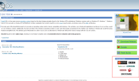
      place the logos under the green buttons (Download,...), because:

      • first impression of the site should be the screenshot, after that the downloadbuttons, and as last this additional information
      • it looks very cluttered and unstructured when screenshot and logos are not seperated
      • it is a bad contrast when the logos are on the blue ground; on white ground they will be more highlighted
      Attachments

        Activity

          People

            admin admin
            zehnvor zehnvor
            Votes:
            0 Vote for this issue
            Watchers:
            2 Start watching this issue

            Dates

              Created:
              Updated:
              Resolved: