Details
-
Improvement
-
Resolution: Fixed
-
Minor
-
None
-
None
Description
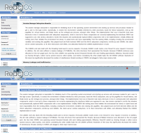
The Newsletter and News section needs some CSS styling.
http://www.reactos.org/newsletter-91
1)Header1 [H1] ("Newsletter") looks as a Header2[H2]("Session Manager rewrite") so the precedence idea is lost.
2)Content shouldnt touch the top-left margin, because it mades much more difficult to read. Styling books recommend some "air" between the right webbrowser border and the main content.
3)The content shouldn't begin just below the H2 but inner.
Since an idea is a responsability, I had added a mockup about a potential solution.Others are wellcome,
Attachments
Issue Links
- blocks
-
ONLINE-321 New Website Revamp - A Metabug for Articles translations and Co.
-
- Closed
-
