Details
-
Improvement
-
Resolution: Fixed
-
 Major
Major
-
None
-
None
-
None
Description
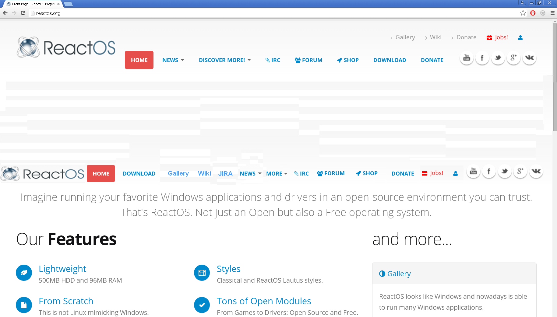
Currently there are several issues concerning the websites header.
1.) scrolling down makes ros logo resize and jumping -> looking ugly
2.) scrolling down hides some items from menu header (if user wants to access them, he needs scroll upwards again)
3.) header itself is pretty big in y and resizes
4.) some items like "donate" are redundant within the header
5.) some important things like a quick way to JIRA are missing
I feel we get a better user experience, in case we:
1.) reduce the header size in y and make its size static
2.) fit every often used option into that menu-bar
3.) rename "Discover more" into "more" as its shorter
4.) add a JIRA link into the menu bar.
A smaller and nevertheless more complete header leaves more space for the view and simplifies navigation.
Here is a screenshot that shows a proof-of-concept of how it could be...
(top is current, bottom is my idea)
In case you feel there is too much within that new single line, I could imagine moving "shop" into "more".
Hope you like!
cc vicmarcal